It’s crazy how fast a year passes. A lot of miles traveled and a lot of places visited. To help reflect on everything, I put together some spreadsheets. This blog post attempts to use those spreadsheets to summarize our travels. A lot of this data was compiled from memory and digital records (my phone). Some data may be missing, some of the dates may be incorrect, but this is mostly accurate.
(The graphs may appear to be pretty small, you you open the images in a new window or tab and see the larger image)
Here we go…
Steps
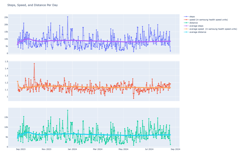
Our phones collect a fair amount of data about ourselves. Luckily, this helped create my first couple graphs. This data was downloaded from the Samsung Health App. It has been keeping track of all my steps, distance and speed. These graphs show the daily values and the line down the middle is the average value over time.
Miles
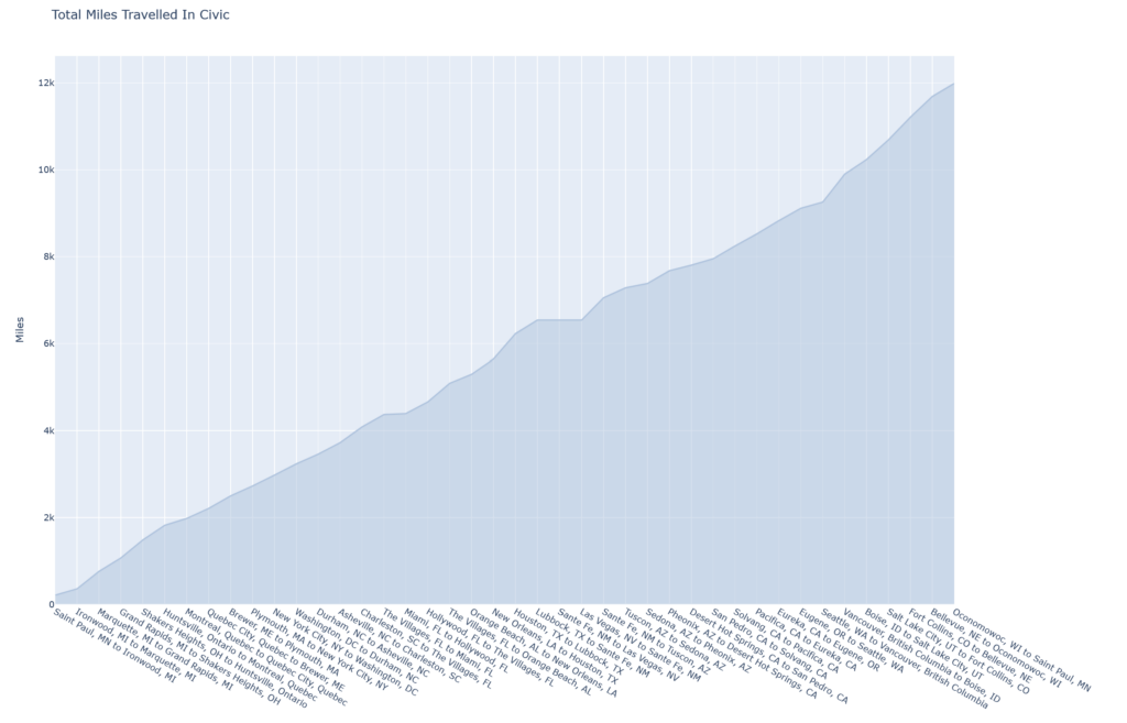
Our feet were not the only ones putting on some miles. Our Honda Civic also put on some miles. The distances recorded were taken from city to city where we stayed, and so this is more of an estimate than actual values. In hindsight, it would have been fun to capture actual miles and time spent in the car.
This first graph shows the total miles traveled from place to place. These are only miles that we encountered while traveling from one stay to another, and it does not include miles traveled within the cities that we stayed in.
I also thought it would be interesting if there was any correlation between the number of miles traveled and the number of states, and so here is the next graph.
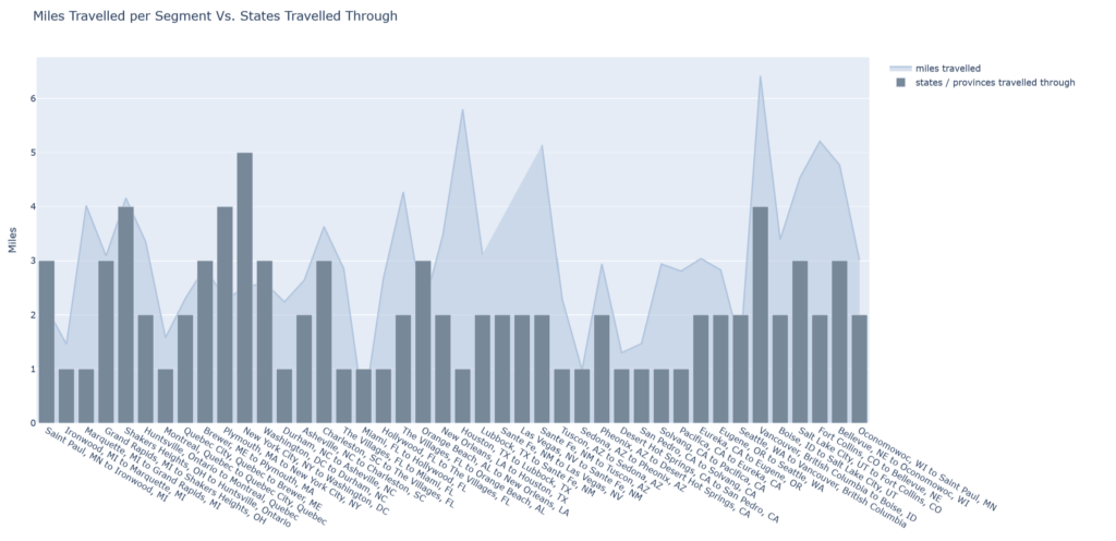
Speaking of states… We traveled through 35 unique states, 3 Canadian Provinces, and 8 (including airport layovers) European countries.
Places
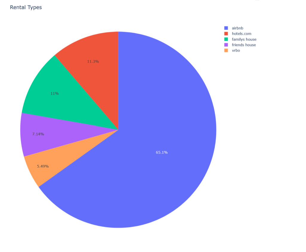
Curious about where we stayed? Part of the data gathered was where we stayed and the type of rental. This next graph shows a breakdown of the types of places we stayed.
Co-working
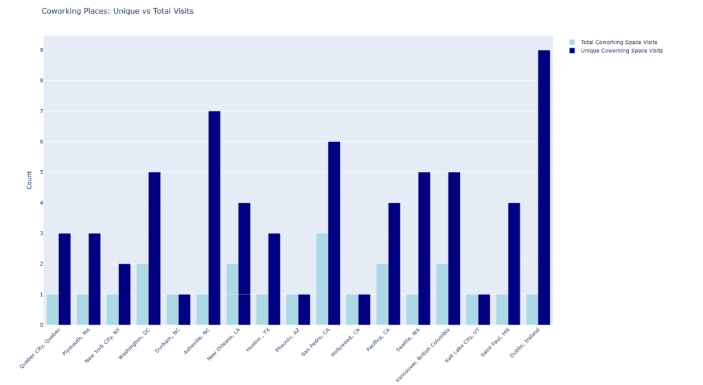
While we stayed at these places I was working as well. Some of these places were not as ergonomic as one would hope for or the internet was not that great. Co-working places to the rescue. Going to a co-working place also gave me the opportunity to see part of the city and sometimes meet new people. This next graph shows the number of unique co-working places as well as the total count for each place we stayed.
Casinos
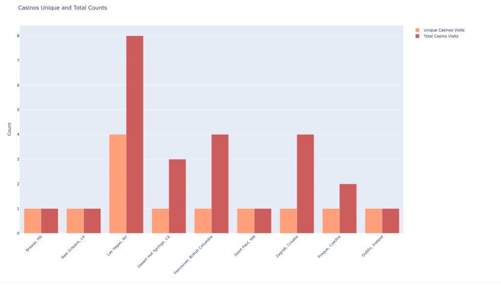
It wasn’t all work though, I was able to visit some casinos along the way as well. Some cities were better than others. I had met up with some friends in Las Vegas, and to be honest, I am not sure if I got all the counts correct in this city. This is a graph similar to the co-working one, but with casinos.
People
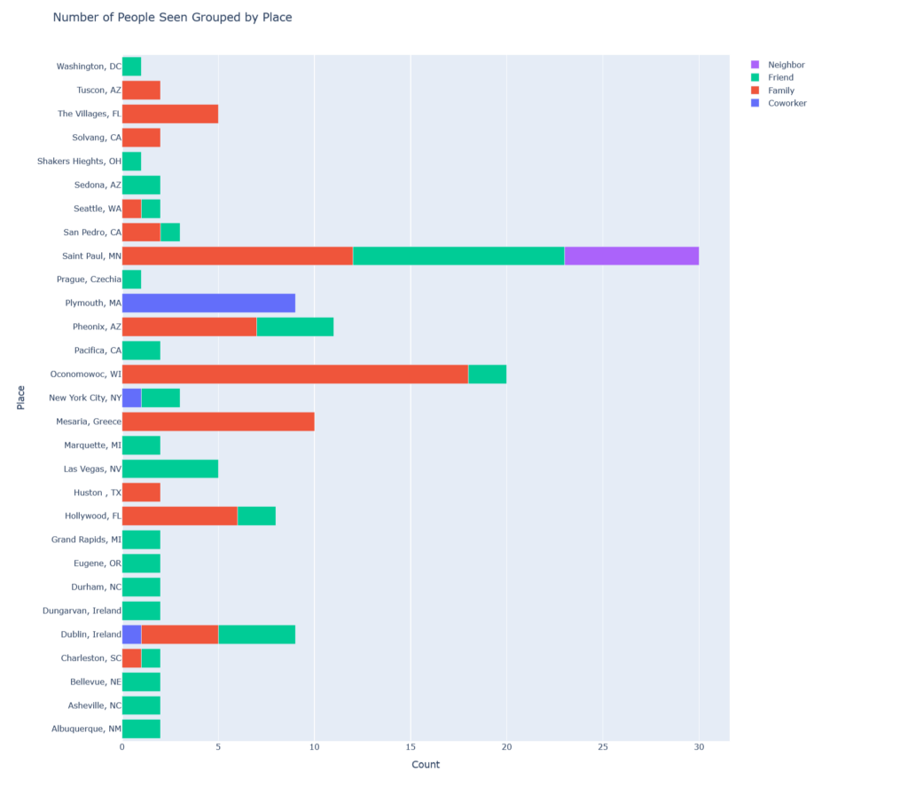
By now you are probably wanting more bar graphs. This next graph is a horizontal stacked bar graph that should help meet the needs for those looking for more bar graphs! This one describes the counts of people that we had seen along the way. It gets difficult to count all the people especially when we were back in Saint Paul – I already know I didn’t count a few people in the twin cities. And so, I counted only people that I had spent more than one hour with. At any rate, here is are the counts (knowing that the Saint Paul location is under counted by a little bit)
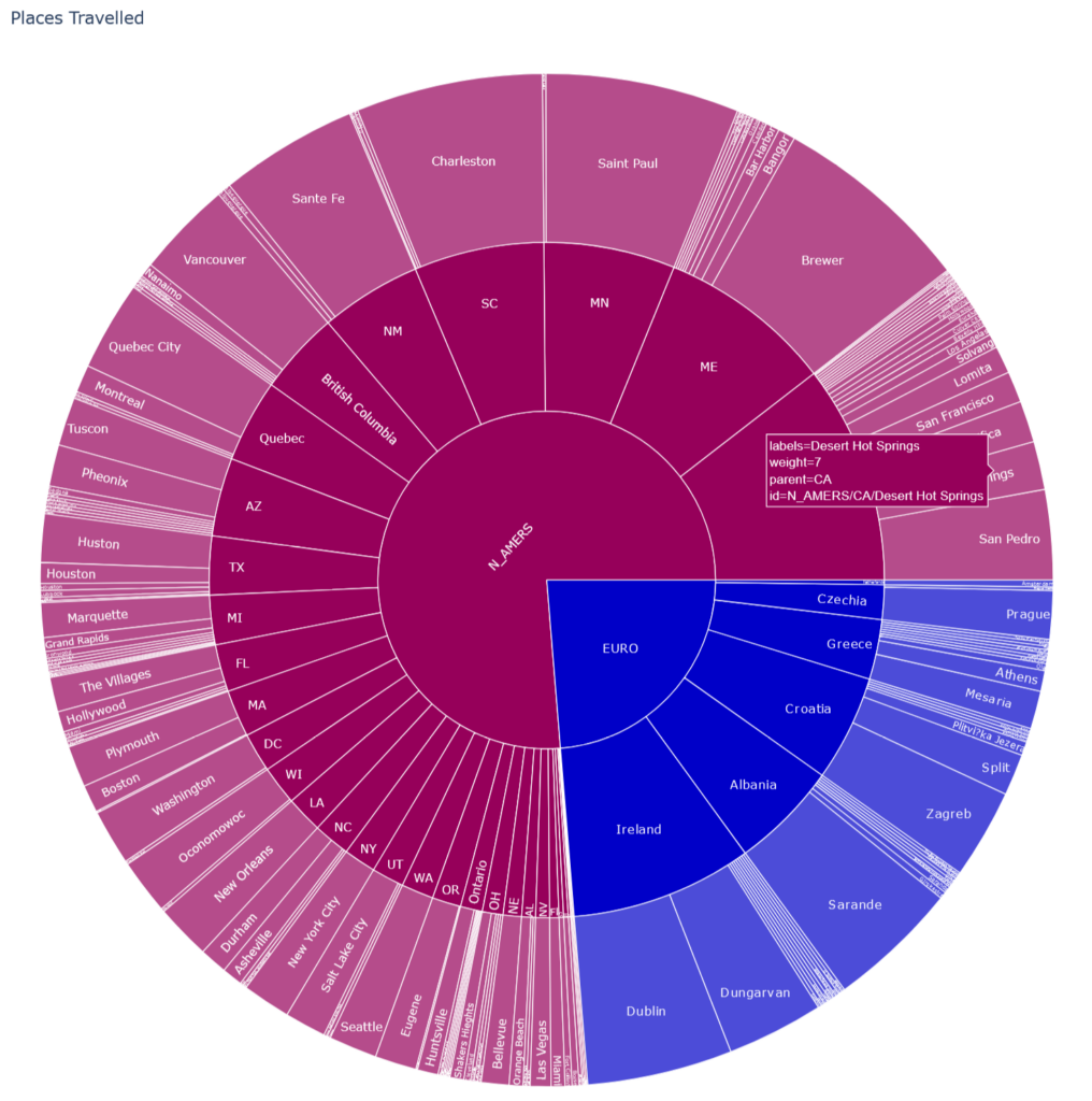
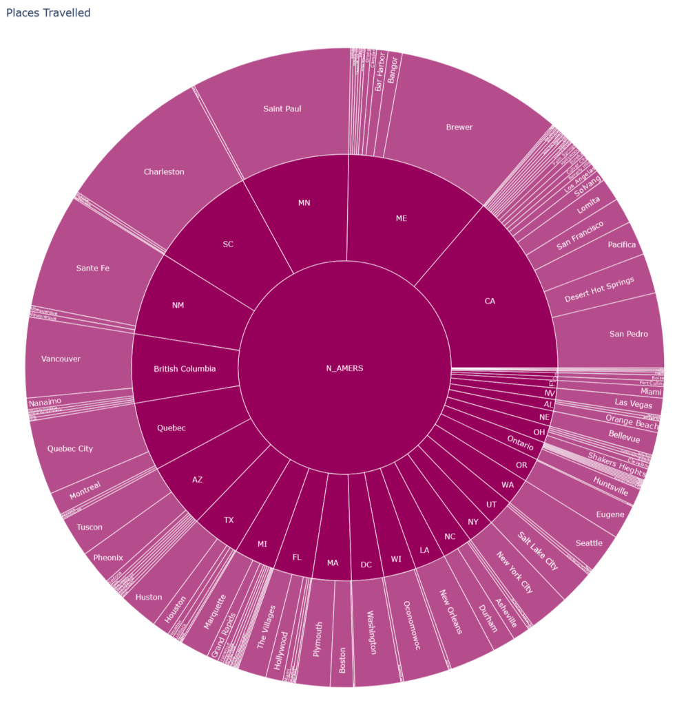
This second picture shows the North American (labeled as N_AMERS) portion of the sunburst chart:
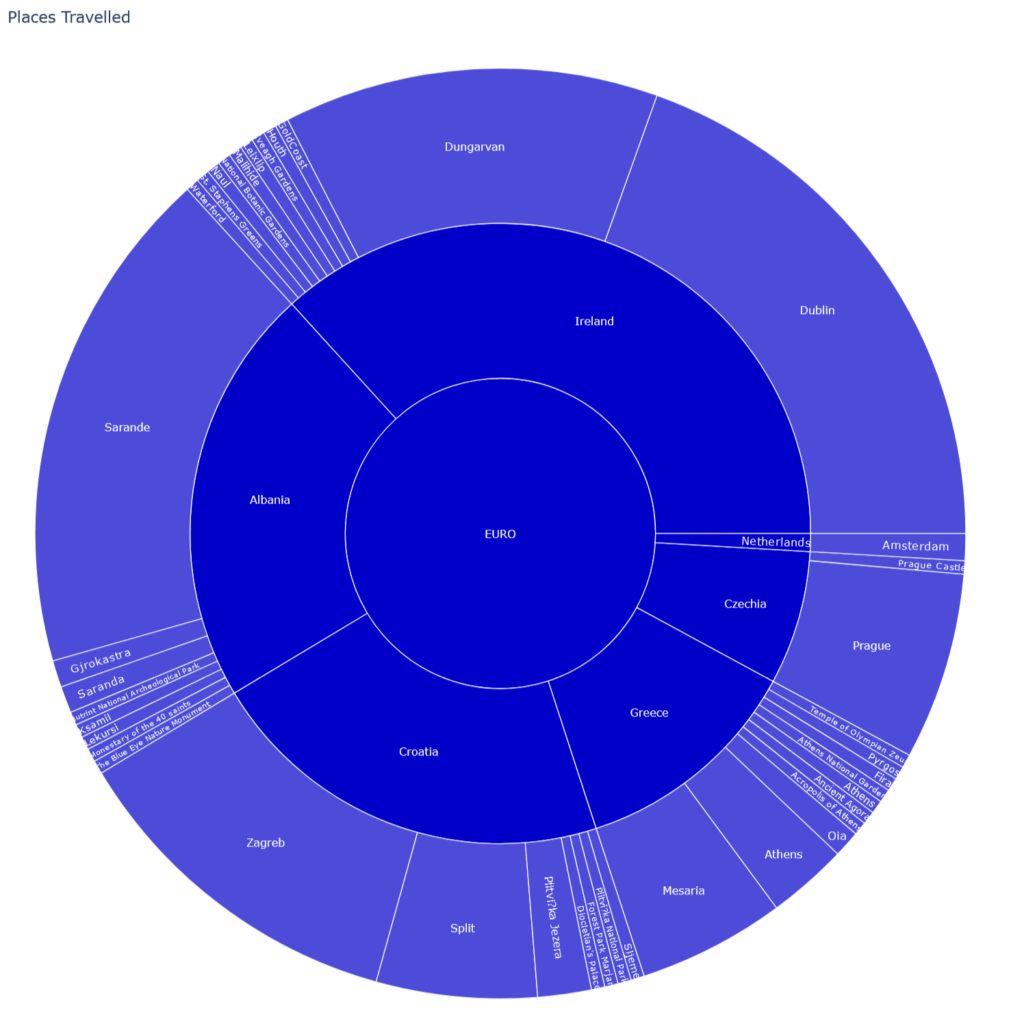
Finally, this third picture shows the European portion
